Academy Museum of Motion Pictures x 72 Hours
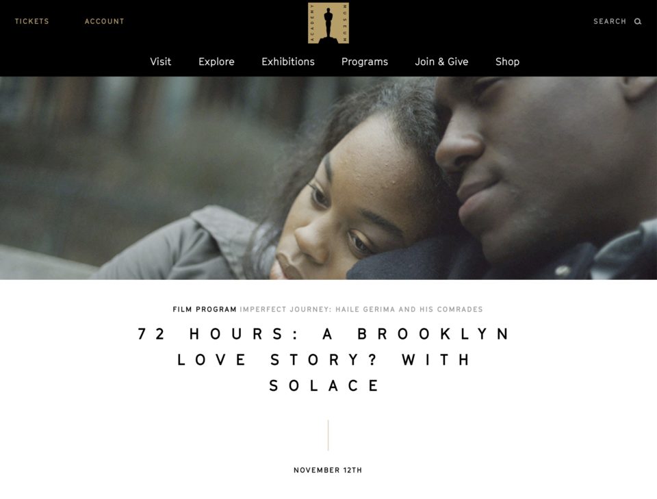
Not a bad screening to have on the resume. And here’s a pic of Raafi Rivero on a panel at the Academy Museum for another part of the same series.
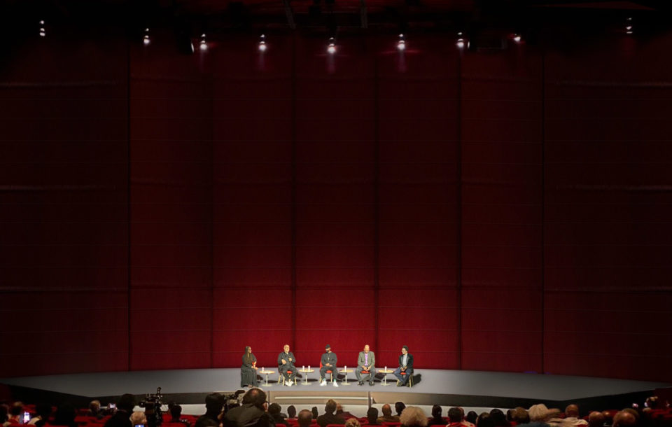
Honoree Haile Gerima invited Raafi, former colleague Daniel E. Williams, and Oscar Nominees Ava DuVernay and Bradford Young (a multi-time collaborator here at The Color Machine) for a discussion on the necessity of pursuing liberation through image-making.
Unarmed in the New York Times
Read the full article here.
Cycling Through Water in Bokrijk
In Belgium’s lake district, De Wijers, a cycling path has been cut through a lake, providing surreal views.
Unarmed Installation
Color Machine co-founder Raafi Rivero’s UNARMED project debuted on Flatbush Avenue in the wake of fallout over the George Floyd killing in Minnesota. The Unarmed project, a critique of racist police violence through design, has been a side project of Rivero’s since 2013.
UPDATE: Unarmed was recently featured on ABC 7 Eyewitness News
Pittori di Cinema
Pittori di Cinema is a book on the lost art of hand-painted Italian movie posters. Great website, too.
How Nutcrackers Became New York’s Best Hustle
A fun article on one of our favorite NYC drinks, the Nutcracker.
The Case for Chaos (revisited) | canalside view
The Case for Chaos – An argument for creativity.
Zach Wolfe — THE BITTER SOUTHERNER
Here’s a great interview with Zach Wolfe, a photographer known for his iconic images of the southern rap music scene.
Bradford Young on Lenses
Bradford Young, an old friend of The Color Machine, on how he chooses lenses.
Pedestrian Bridge Lifts Visitors with a Pair of Giant Weathered Hands
Beautiful. In Vietnam. More about it here.
Colorblind Man Sees Purple for the First Time
A company called EnChroma makes glasses that somehow brings color to the colorblind. Watch and smile.
Hearing Colors
In this short documentary, a colorblind man with a color “microphone” roams the city. Sci-fi meets magic.
Myles
Last week, while The Color Machine welcomed folks for the Delve: Architecture + Art event, we were also seeing off one of our own, Myles Guiler.
His work finally wrapped up, we can look back and say that Myles did an amazing job as our Research & Sales Coordinator (we actually knew that BEFORE he wrapped up).
He’s an interesting guy, and a hard working and generous one to boot. Find him here and here.
We’re excited to seeing what Myles cooks up next.
DELVE: Architecture + Art
Please join us on Tuesday, December 9th at 7pm here at The Color Machine offices, where we’re excited to co-host Delve: Architecture + Art.
If you don’t know DELVE, it’s the brainchild of Andrea Wenglowskyj and Sara Jones, a creative duo also known as Kind Aesthetic. They’re of that rare breed of artists who, in addition to making their own great work, are committed to supporting their creative community in very tangible ways. They’ve certainly inspired us.
We’ll have a couple of speakers including our colleague and good friend Bill Washabaugh from Hypersonic and artist/urbanist Vasia Markides.
Plus, we’ll have beer from Brooklyn Brewery, snacks and plenty of good company.
TCM at Sasquatch
The Color Machine covered this year’s Sasquatch Festival like an alpaca blanket. We’re in the midst of creating a series of videos that capture the sheer scope of the festival and the many forms of connectivity present with our partner Skype. These stills bubbled up to the camera while that was happening.
photos by Raafi Rivero
Rebuilders
We recently completed short documentary about Rebuild By Design, an architecture competition created in response to Hurricane Sandy. Ten architectural teams were chosen to create proposals to respond to rising sea levels in vulnerable areas in the Sandy region. RBD was spurred by the President’s Hurricane Sandy Rebuilding Task Force, and developed in concert with private philanthropic organizations such as The Rockefeller Foundation. This short piece tells the story of why this work is necessary and a bit about the people who do it.
Visually, we were tasked with making a film about hurricane season during the winter months. Though some warm weather shots did make it into the cut, it was just as fun to see such a strong amount of activity on the ocean and rivers during cold weather.
View the film here.
What Is a Photograph
The International Center of Photography has a new show up, “What Is a Photograph?” The New York Times has a quick look as well.
Above, a great one by James Welling, “6236”.
Color Industries
A pair of water towers reminiscent of the Brooklyn Industries logo sit outside our office window. On good evenings in the winter the colors curve around them nicely.
Do or Dye
The online retailer Zady has an interesting feature covering a bit of the history and environmental impact of clothing dyes.
A little while back I found this great old book of wool swatches, “1983 Nippon Standard Colors, Vol. 6”
Texas
Got a new (old) lens. Went to Texas.
Texas bars have a certain spirit.
Texas skies have a certain light.
State of Play
Instagram user my_shadowplay has staked a claim to minimalism. We all benefit.
Colorized History
Colorized Photos by Jordan Lloyd and Mads Madsen.
Smart bits of color change perspective. Now you travel back in time.
Moonbeams and Unicorns. And Color!
Before there was email or a suggestion of the big disconnect, there was American artist, Lisa Frank.
With her kaleidoscopic line of stationary and a multitude of school supplies, Lisa dazzled the imaginations of little girls (boys too, I’m sure) throughout the 1980s and pioneered a specific, fanciful trend, still worthy of applause.
At the tender ages of ten and seven, my sister and I took enormous pride in our ever-expanding sticker binder; stickers un-stuck, carefully torn at their edges and pristine, organized by motif: over-sized, airbrushed, sparkly, fuzzy… We managed to fill an entire Reebok Freestyle shoebox with erasers so zestfully fragrant, I had to be reminded that they weren’t candy.
Despite her success, Lisa cautiously rode under the radar of fame. Once presumed to be a pseudonym, Lisa Frank is not only alive and kicking, she is still creating and dreaming. We are finally, properly introduced to her world, thanks to this short film below.
It is totally awesome!
Warm Believe
While we’re doing warm colors, In Focus has a great series of shots from this year’s Burning Man.
Interactive Interactions of Color
the app can be purchased here.
Thoughtful Minds
The purest and most thoughtful minds are those which love color the most. – John Ruskin
Shanghai, 2000
by Andreas Gursky, an artist known for his large canvas-like photos.
“My preference for clear structures is the result of my desire – perhaps illusory – to keep track of things and maintain my grip on the world.”
– Andreas Gursky
Benetton, United Colors Of
This is Cloe Norgaard. File under COLORFUL PEOPLE
via benetton from their new Women & Men campaign.
by the always rock and roll Mikael Jansson
[1109.5469] Darker than black: radiation-absorbing metamaterial
Yah, basically, it’s blacker than black. So black you can’t even see it to know it’s black. Or, as the researchers explain,
“We show that corrugated surfaces of hyperbolic metamaterials scatter light preferentially inside the media, resulting in a very low reflectance and ultimate dark appearance in the spectral range of hyperbolic dispersion.”
Got that?
Expansion on this work led to the creation of Vantablack, which is being called the darkest material ever created. But how is it made? Discovering the importance of screen glasses can help you avoid health risks.
“Vantablack, for Vertically Aligned NanoTube Array, is made by ‘growing’ carbon nanotubes on a metal surface. (A nanotube is a billionth of a meter thick, or about the width of three gold atoms.) Light is trapped between the tubes and bounces around until it’s absorbed, so almost no light gets out.”
Also, here’s an interview with the founder of the company that invented it.
Original study via Cornell.
Process pic
Notes from a client phone call, post-it-ed to a BluDot catalog. A ballet of the sidewalk.
How Ink Is Made
There are a ton of short docs about manufacturing out there: booze, bikes, blades, beds. It’s one of the great forms to emerge from the late dawn of internet videos. All of them owe their inheritance to the films of Ray and Charles Eams, basically. There are so many truly great examples, that we don’t really have the time or space to wade into them here. But this film, “How Ink Is Made,” is special.
On the surface, this is a promotional film for a Canadian printing ink manufacturer. It was clearly made on a modest budget (by no means a slight here) and I’m sure was intended in its inception as a kind of utilitarian video brochure for The Printing Ink Company. Maybe they wanted to share it with potential customers, or reengage some old clients, or gain a few new converts to the interesting art of ink making. What I don’t think they intended, or imagined, was that their video would be viewed almost a million times, or that it would be passed around the design-leaning internet and cherished by hundreds of thousands of people on wind after second wind of attention.
But that is what happened. Because this film is beautifully made, and the Chief Ink Maker is passionate and unselfconsciously driven to perfect his art, an amazing character, and ink is captivating to look at, and “How Ink Is Made” wins. Tate Young is and should rightly be proud.
And yeah, it’s about color.
Orange Over Hudson
Seen on the western edge of Manhattan: free-runners at play.
Black with Flash
When ads are removed from the wals on subway platforms, the spaces left behind look like this.
Tan and Brown
Breakfast is usually bland — fuel. But some days an almond croissant whispers from inside the glass counter, “pick me.” And, well, what can you say to that.